Addressing Issues
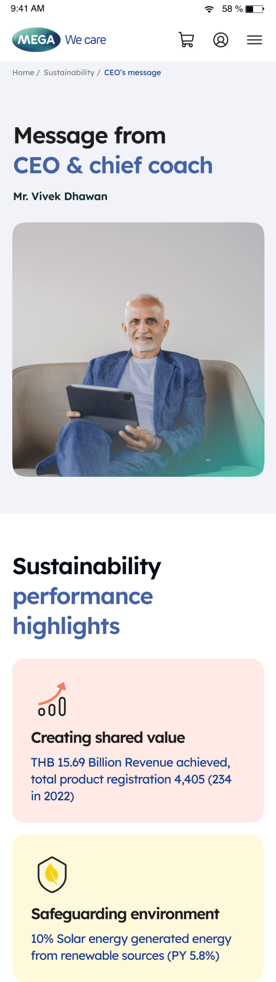
Web and Mobile responsiveness was crucial for the Energy Management and Sustainability pages. Specific challenges included visual hierarchy, data representation, and spacing for optimal user experience on diverse devices.
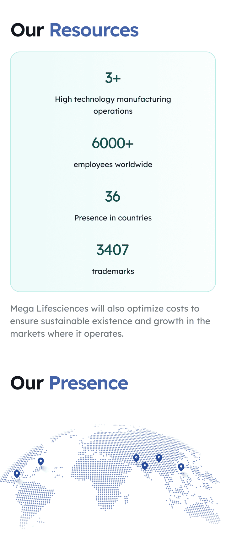
Sustainability


Challenge
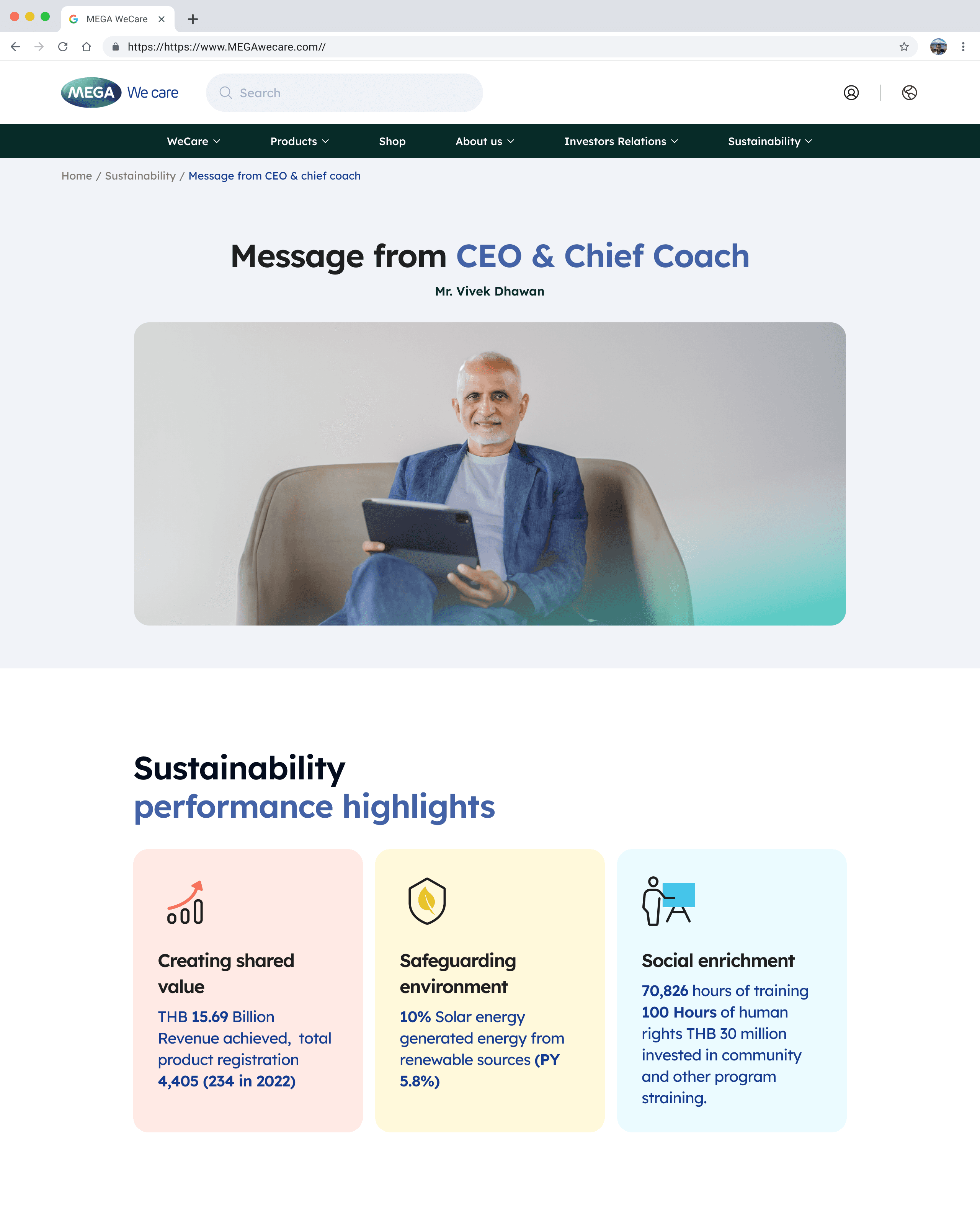
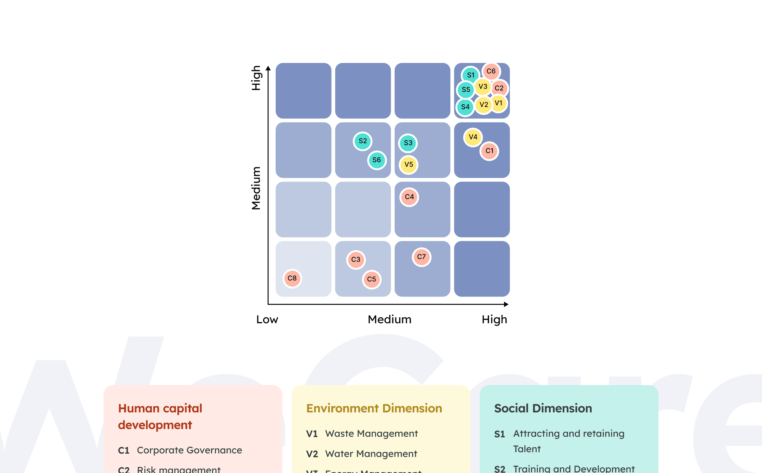
Client feedback indicated issues with visual hierarchy, particularly in the Performance section of the Sustainability module. Key data, such as revenue and performance metrics, lacked prominence and clarity.
Discover
Identified Issues: Analyzed client feedback to pinpoint visual hierarchy gaps.
Correction and Refinement: Addressed the missing visual hierarchy in the Performance section.
Content Prioritization: Highlighted crucial numbers and revenue data for improved user attention.
Senior Designer Collaboration: Engaged with the Senior to ensure the corrections aligned with their vision.
Outcome:
1. Significantly improved visual hierarchy.
2. Enhanced user understanding of performance metrics.
3. Strengthened collaboration with the Senior designers through effective problem-solving.
Energy Management

Challenge
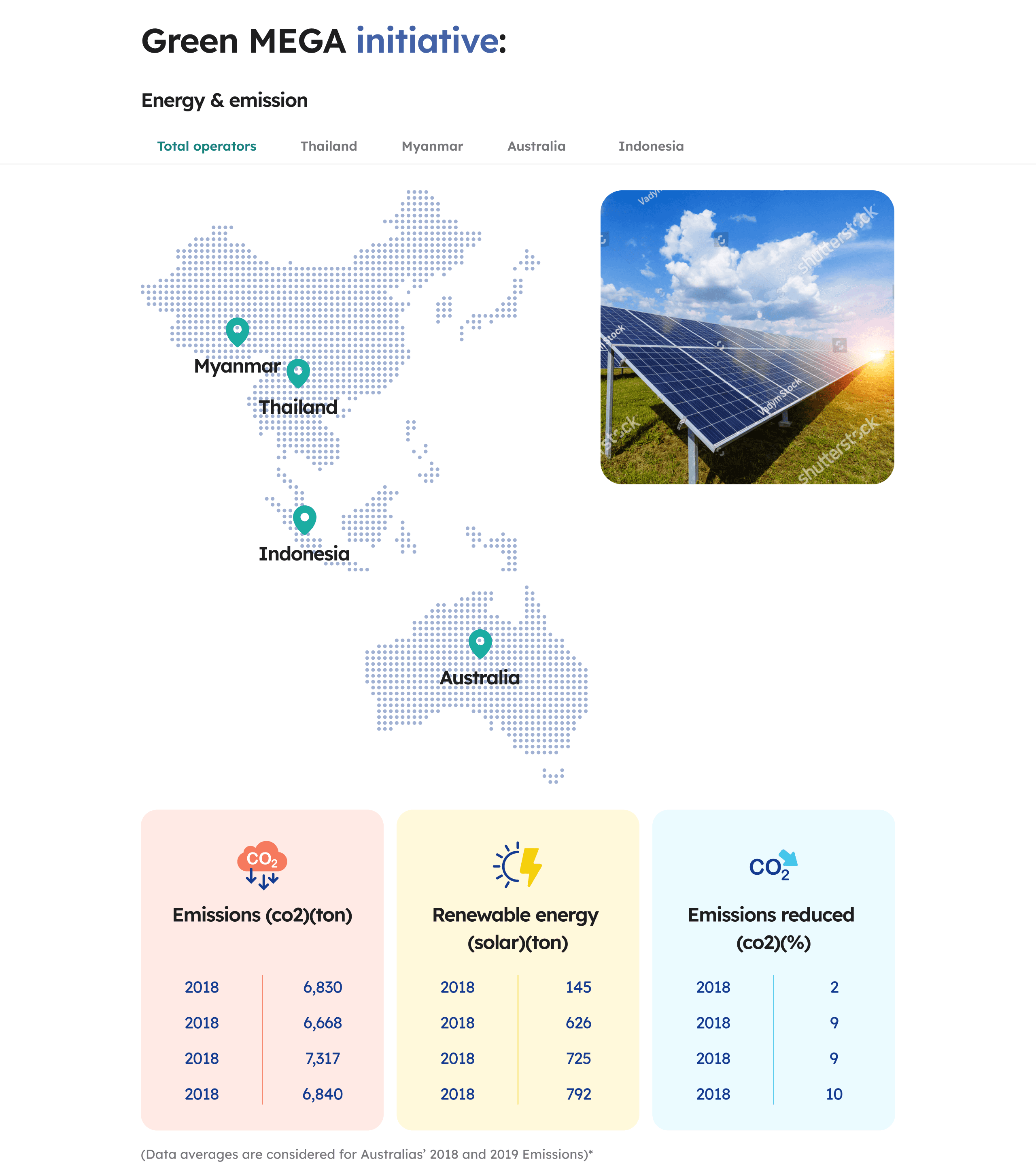
Client feedback highlighted repeating years in the Energy Management page, impacting data accuracy and user comprehension. The goal was to align the presentation of consumption, cost savings, and emissions with the current website and wireframes.
Discover
Identified Data Inconsistencies: Recognized repeating years in the Energy and Emissions sections.
Data Alignment: Adjusted the representation of consumption, cost savings, and emissions to reflect accurate year-to-year changes.
Wireframe Integration: Ensured alignment with wireframes for a cohesive user experience.
Outcome:
1. Eliminated repeating years for consumption data.
2. Aligned cost savings and watt-hour changes with accurate yearly representation.
3. Implemented changes in accordance with wireframes and current website design.
Challenge
Competition in the Healthcare Market
Mega We Care, being a leader in the global pharmaceutical industry, faces stiff competition from various players. The challenge was to redesign the Sustainability Module to provide users with an intuitive and engaging experience that sets Mega We Care apart from competitors.
Enhancing User Trust and Engagement
Given Mega We Care's extensive reach and reputation, the redesign aimed to foster trust and engagement among users. The goal was to create a user interface that not only educates users about Mega We Care's sustainability efforts but also instills confidence in the brand, encouraging prolonged engagement.
Desktop Version


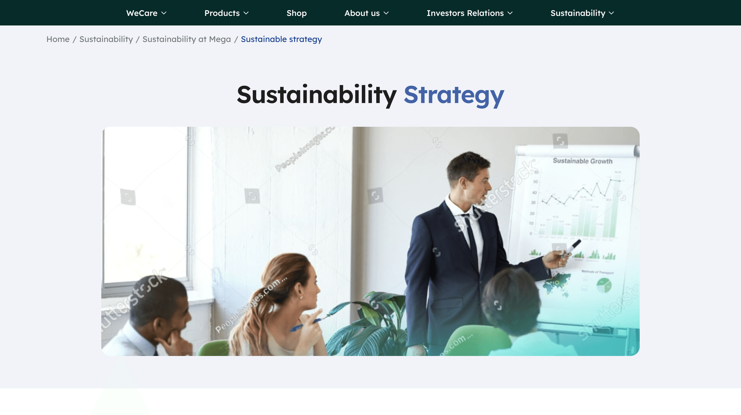
Sustainability
Navigating the design continuity from the previous designer posed multiple challenges that required a comprehensive understanding of the design direction set by senior stakeholders.
Design Direction Clarification:
Objective: Grasping the intended design style and adhering to senior-established guidelines.
Discover: Conducted a thorough analysis of the previous designer's work to align with the set design direction.
Color Styles Mastery:
Objective: Understanding the color palette intricacies, including primary and secondary colors, shades of grey, opacities, and contrast principles.
Discover: Meticulously studied the color styles, ensuring accurate implementation for visual harmony.
Spacing and Layout Understanding
Objective: Grasping the nuances of spacing, padding, margins, and gutter spacing, especially adhering to an 8-point grid system.
Discover: Studied the spacing standards meticulously, ensuring adherence to the 8-point grid for a cohesive layout.
Collaborative Design Process:
Successfully integrated design changes while maintaining visual consistency.
Achieved a cohesive user interface by aligning with established design principles.
Collaborative efforts resulted in a seamless transition to close the project.
Mobile Responsive


That's the end of this tune.
Wanna hop to the next?
Client Work
Lolllypop Studio
2 months
Mobile + Web
Ui Design
Figma , Illustrator
Typography
Headlines
Lexend
Aa
Light
Regular
Medium
Bold
Body Text
Noto Sans
Aa
Light
Regular
Medium
Bold
Colors
Primary
Secondary